
Global Process Automation is an industrial solution company that required a refreshed brand identity. What set them apart was their commitment to a great connection with their clients, so connection was the primary pillar of the new identity.

Old logo.
New logo.

Alternate global icon.
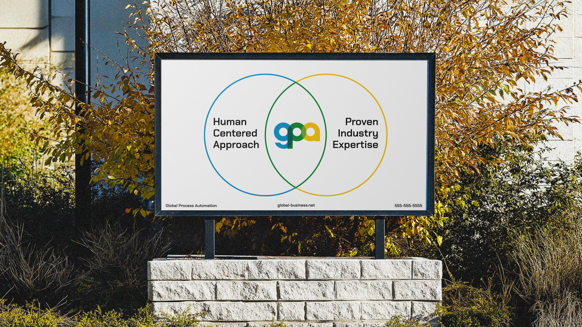
The overlapping elements of the brand represent the connection GPA provides, each instance of overlap revealing a new color, or a new connection.
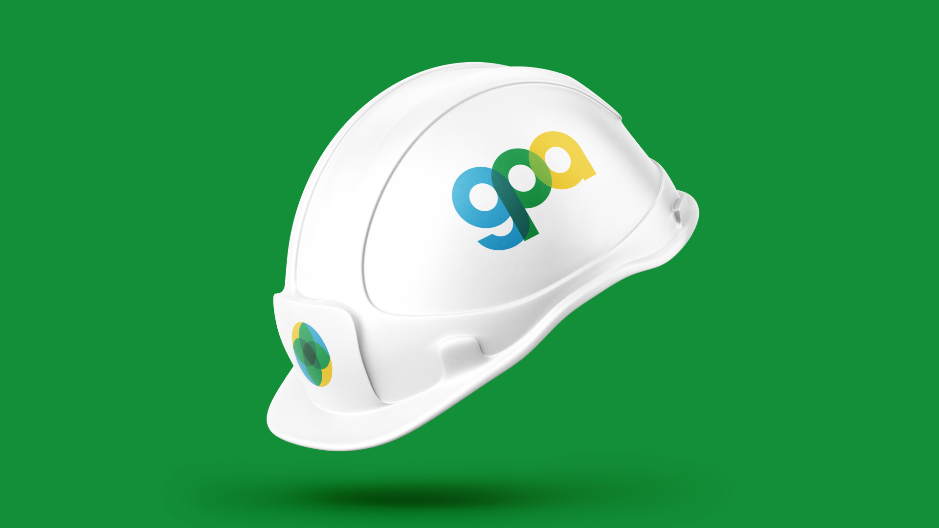
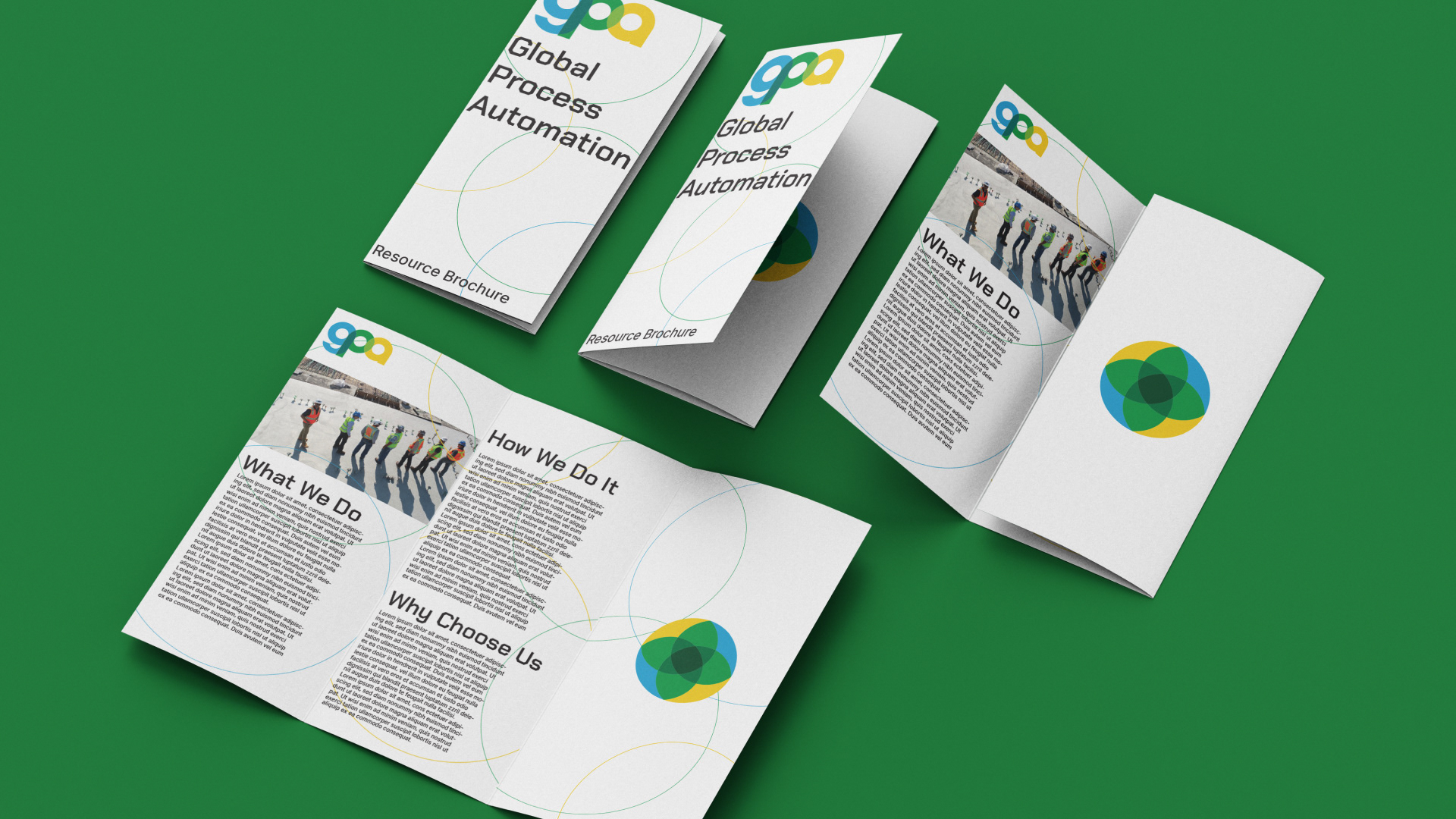
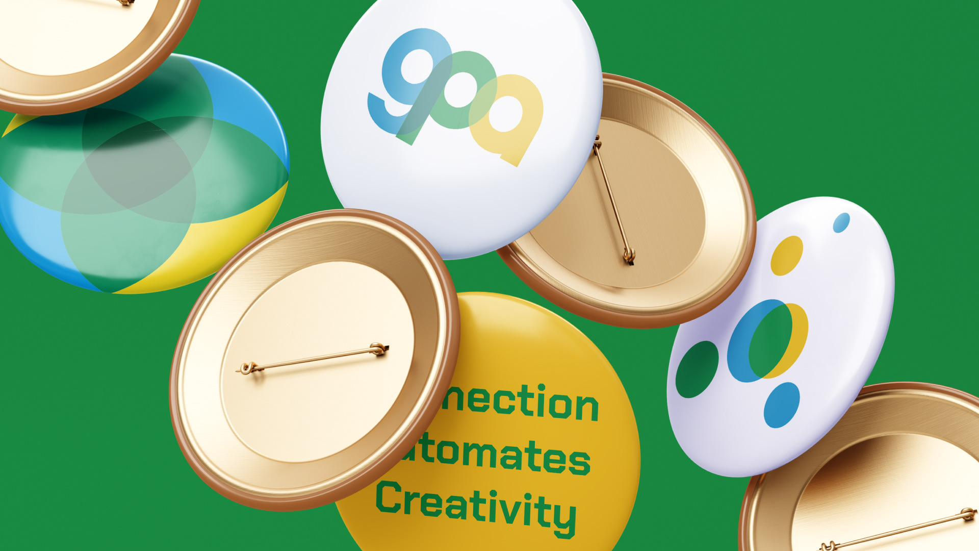
Branded assets.