
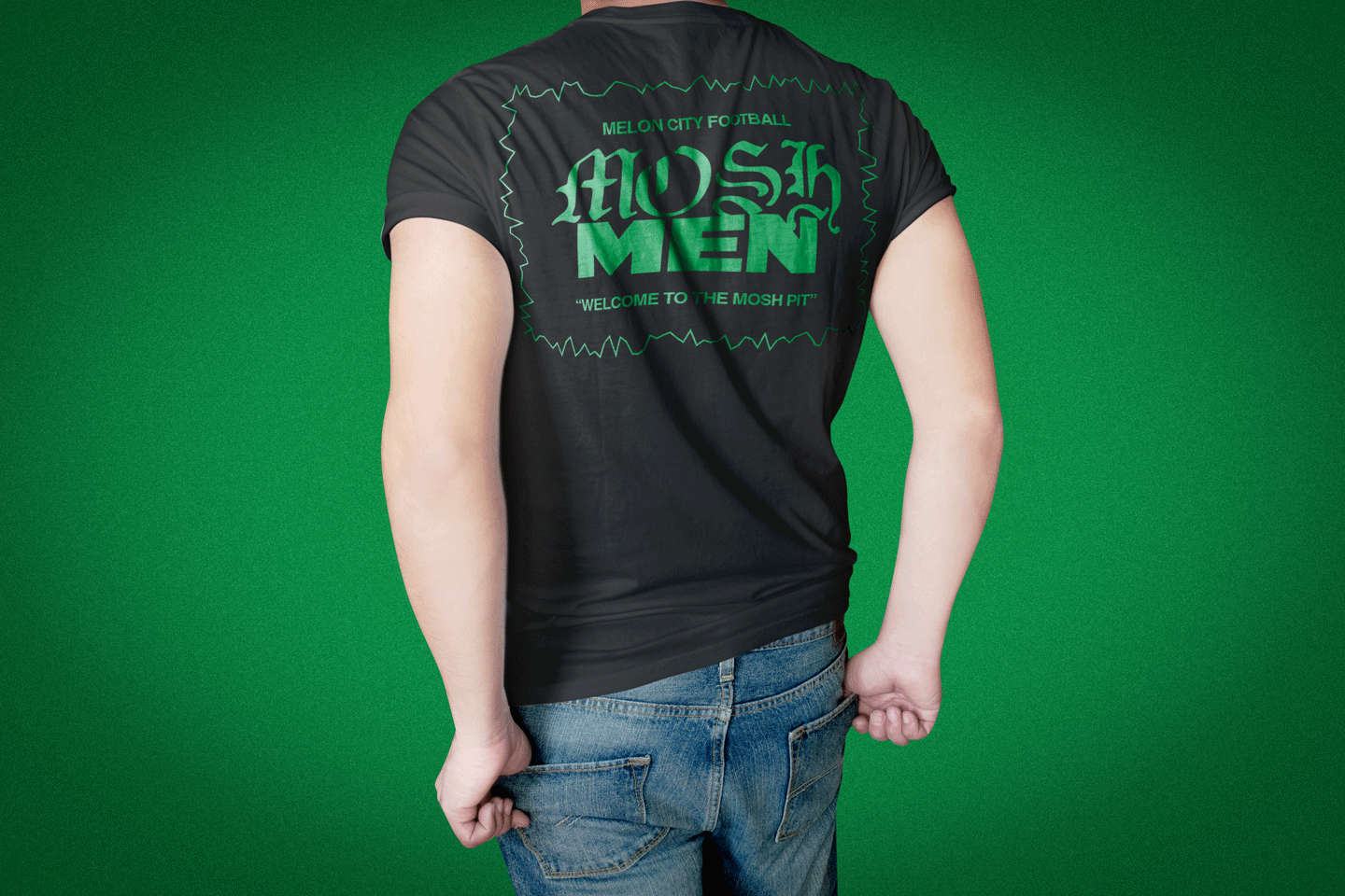
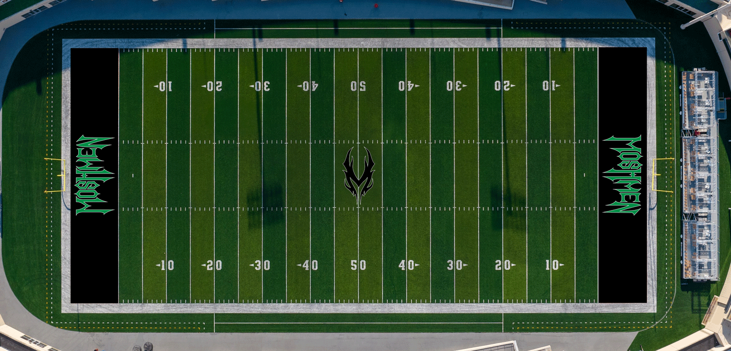
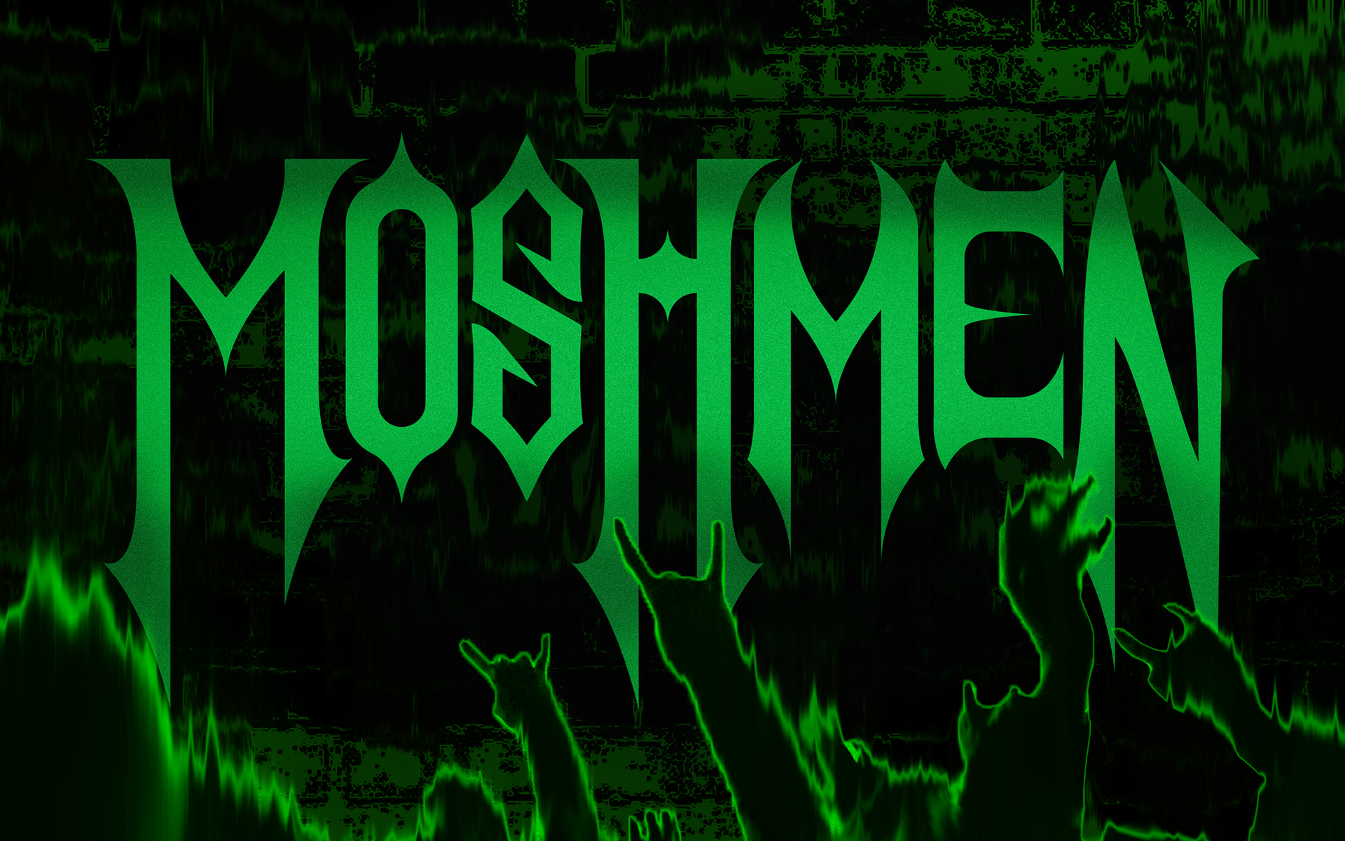
The MOSH MEN are a professional football team with an identity inspired by heavy metal culture. Built to be bold, aggressive, and unapologetic.
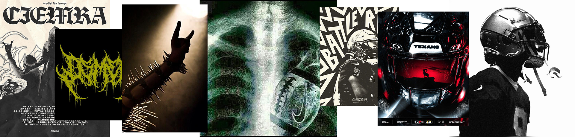
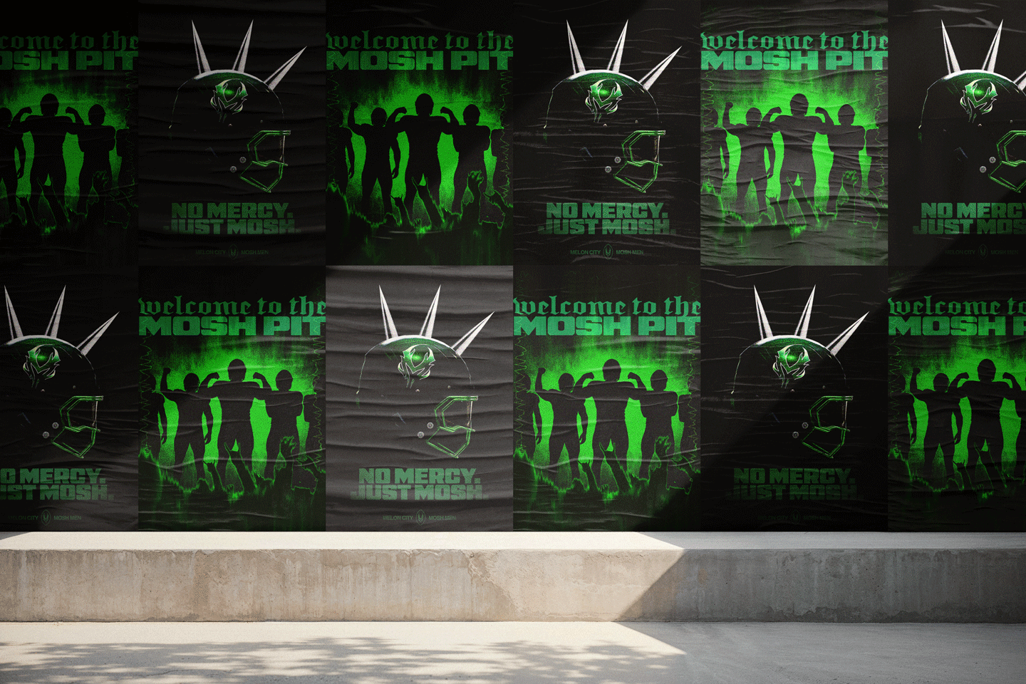
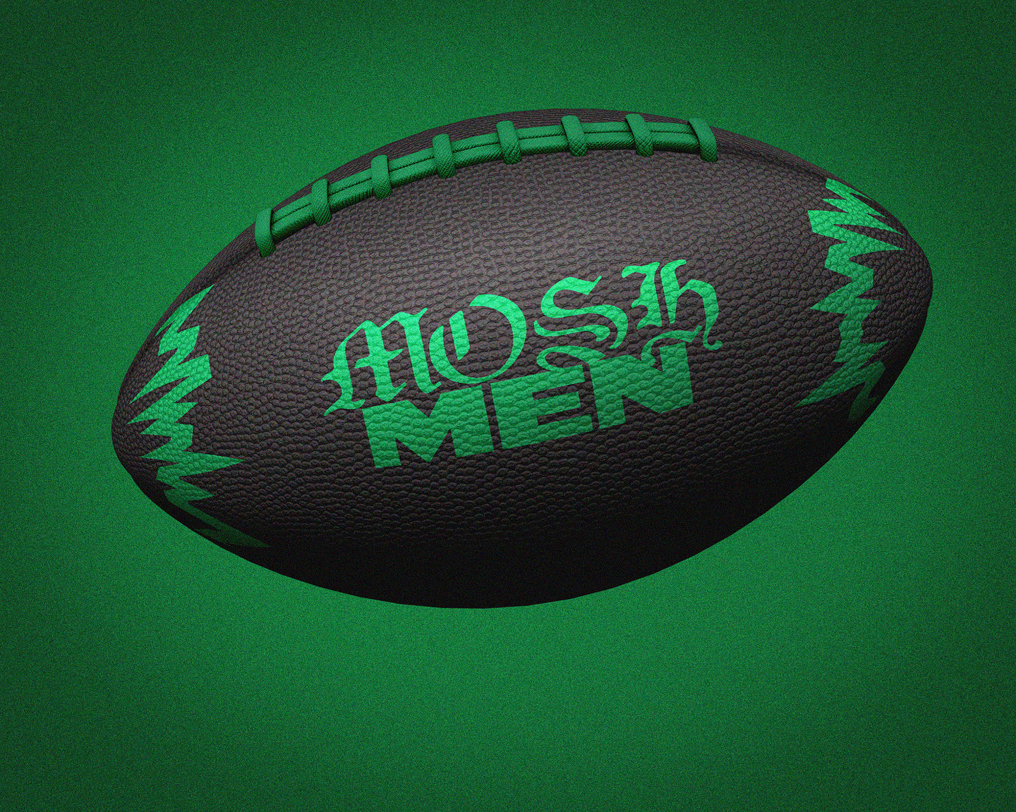
Heavy metal and football aesthetics collide through gritty textures, raw imagery, and aggressive energy.
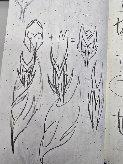
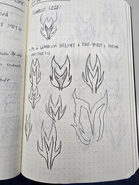
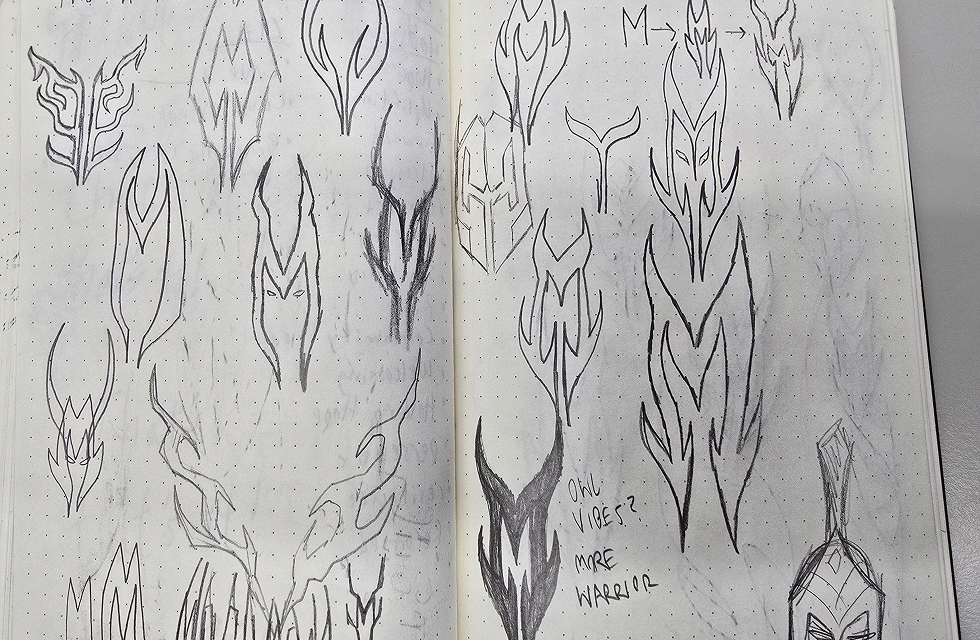
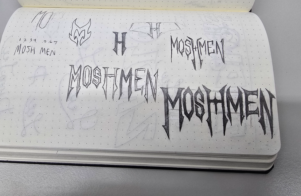
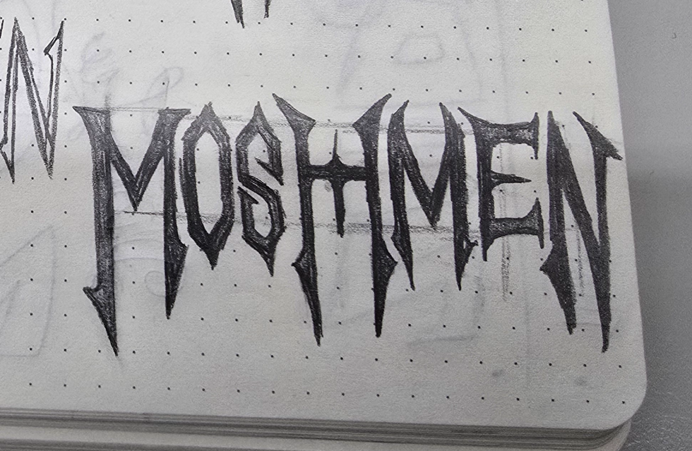
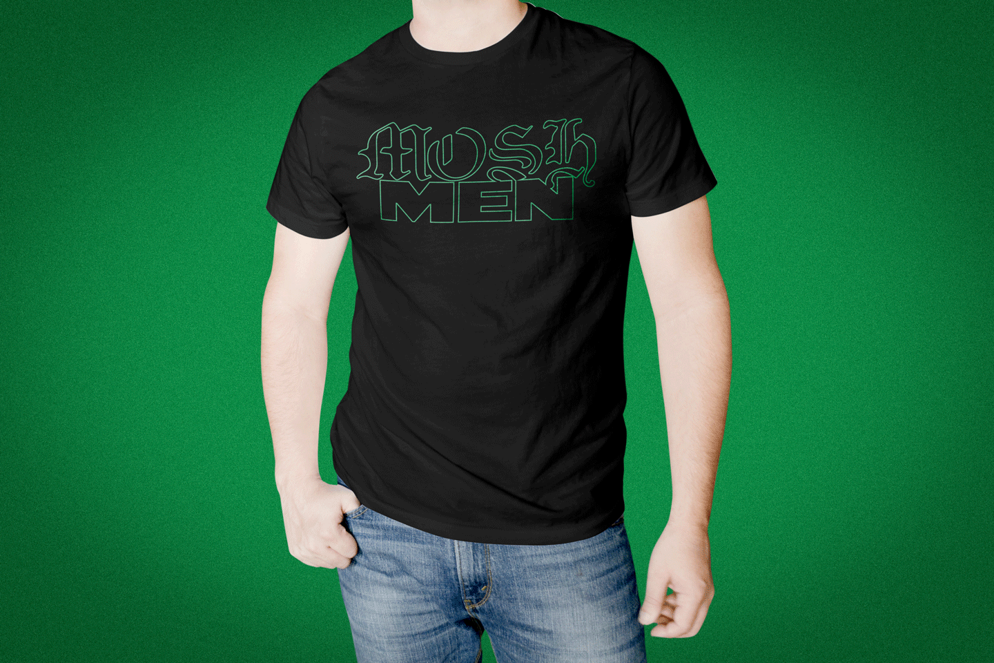
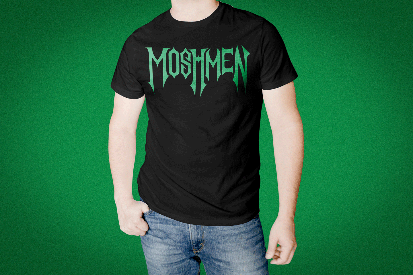
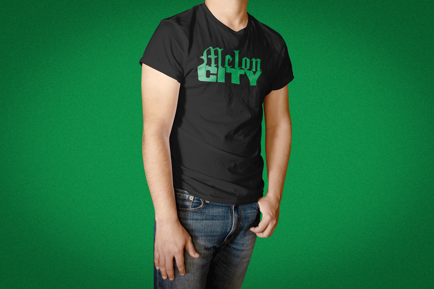
The sketches for both the logomark and wordmark, using inspiration from Heavy Metal band logos.
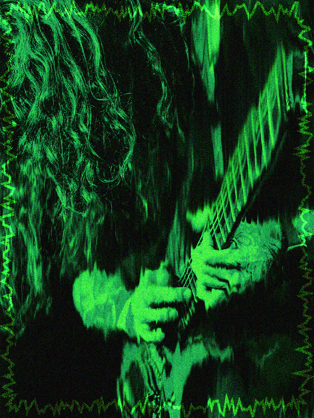
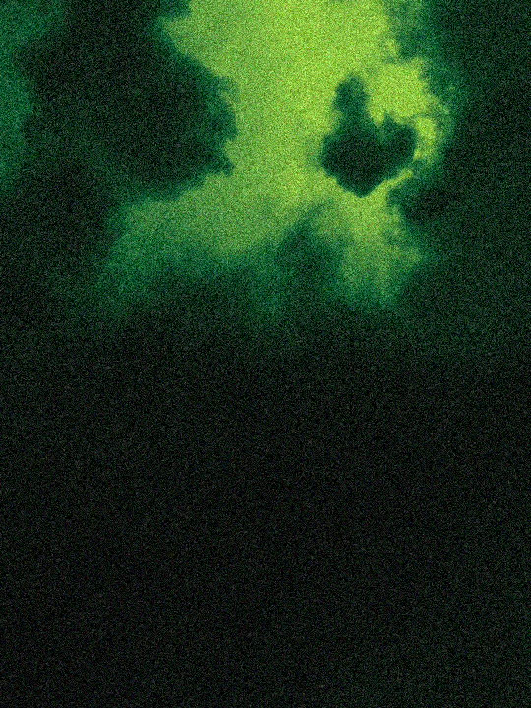
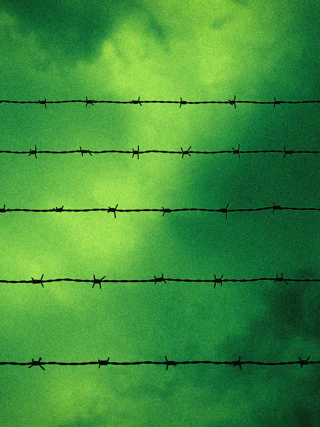
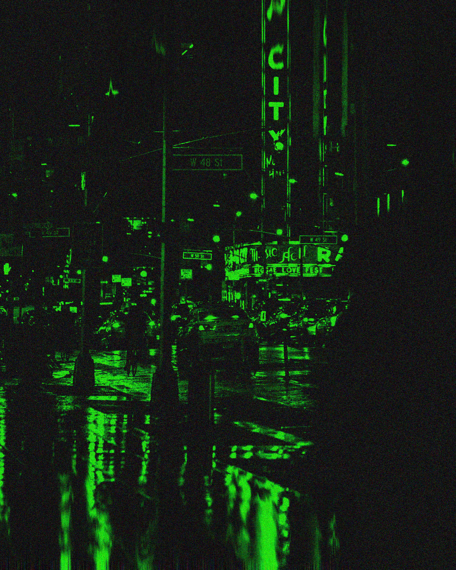
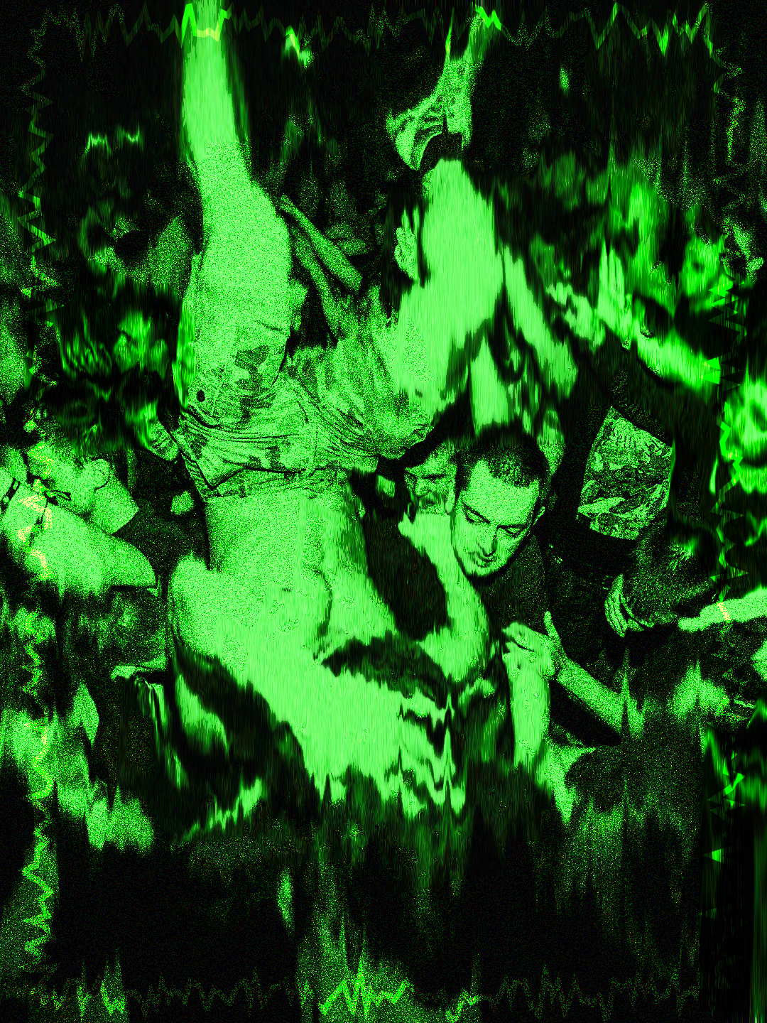
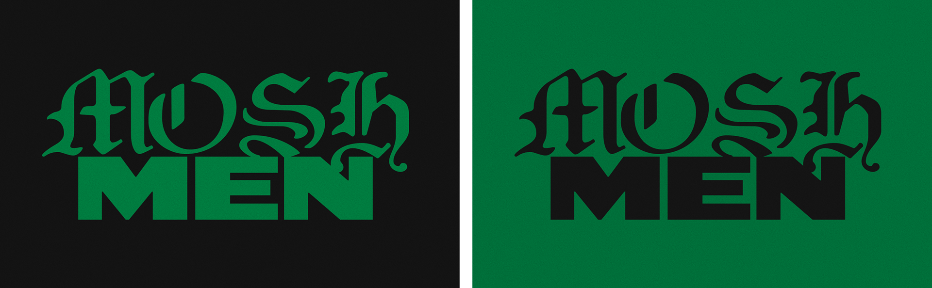
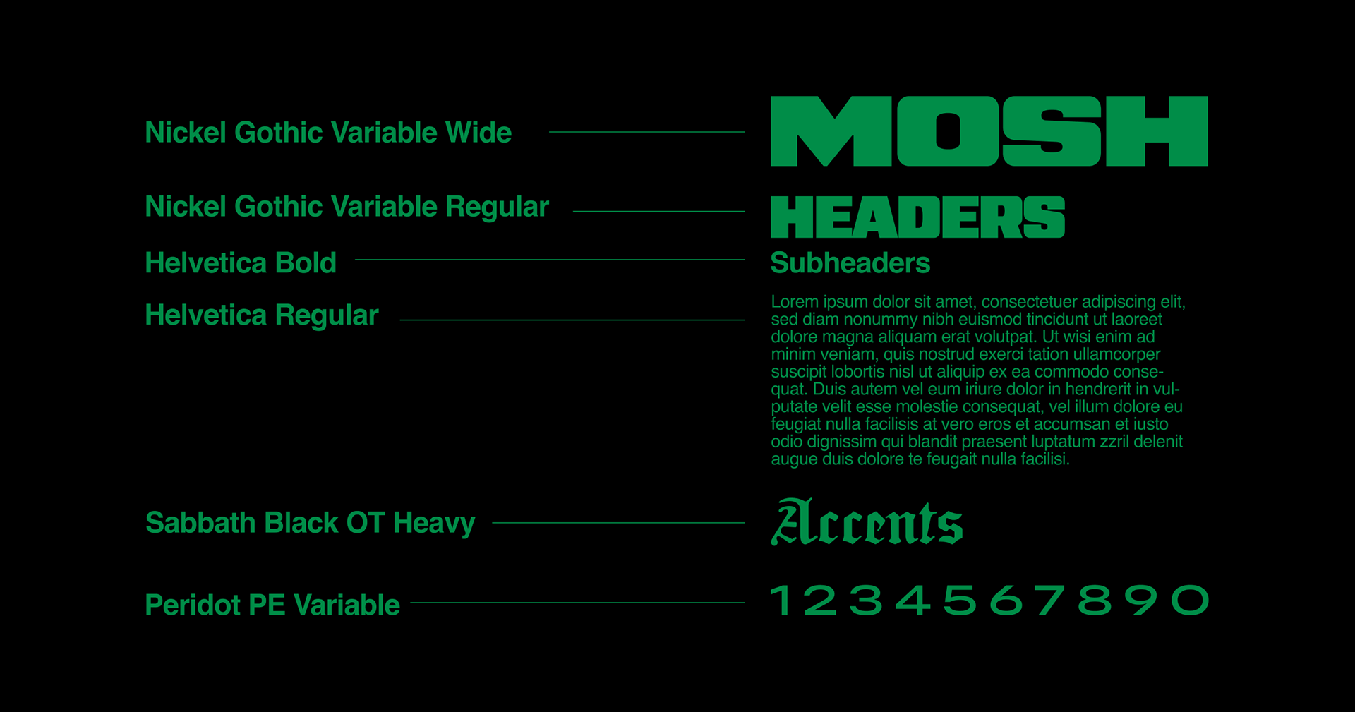
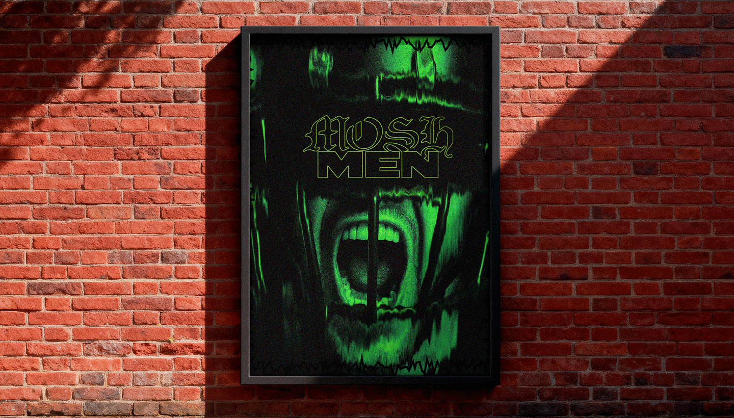
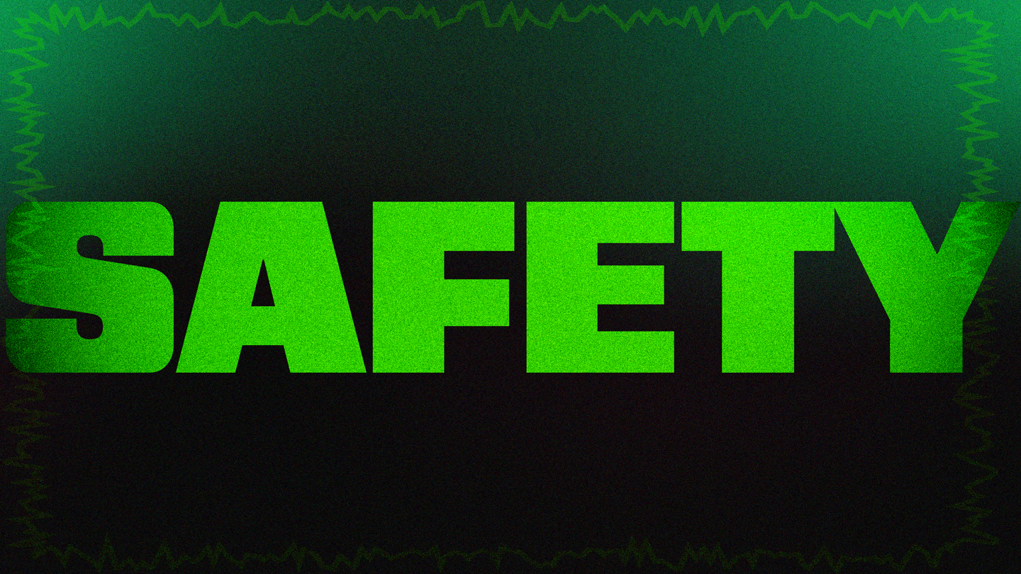
Art and color direction exploration. Use of green and black with grungy grain and on brand border elements.
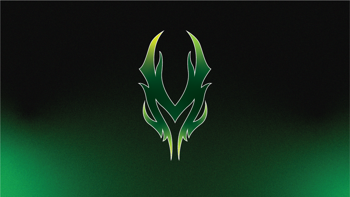
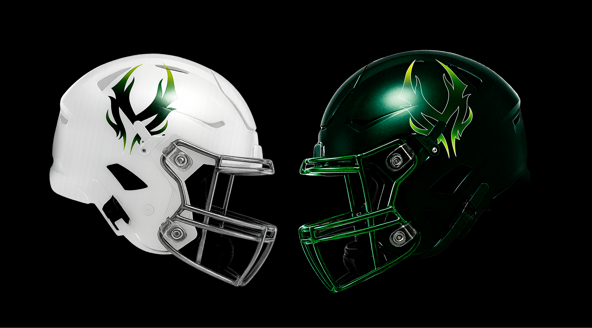
Primary Logomark
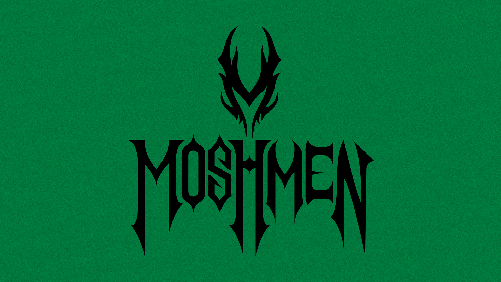
Logo and Workmark Lockup
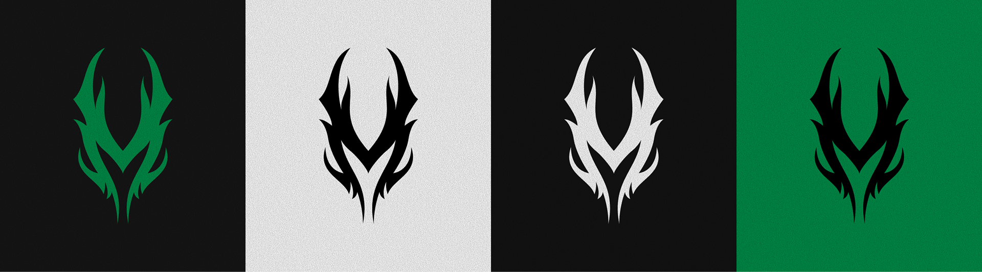
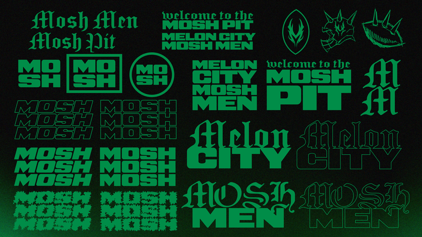
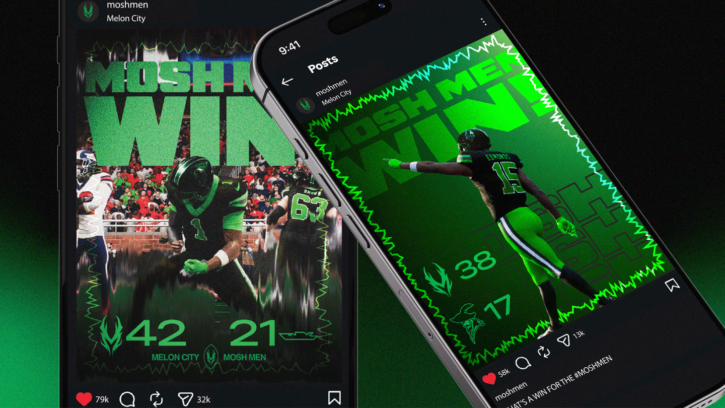
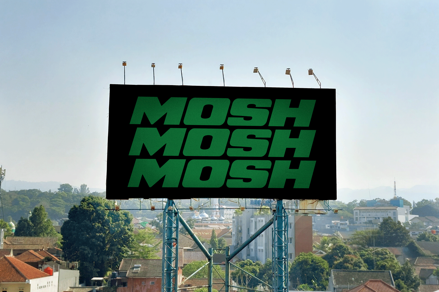
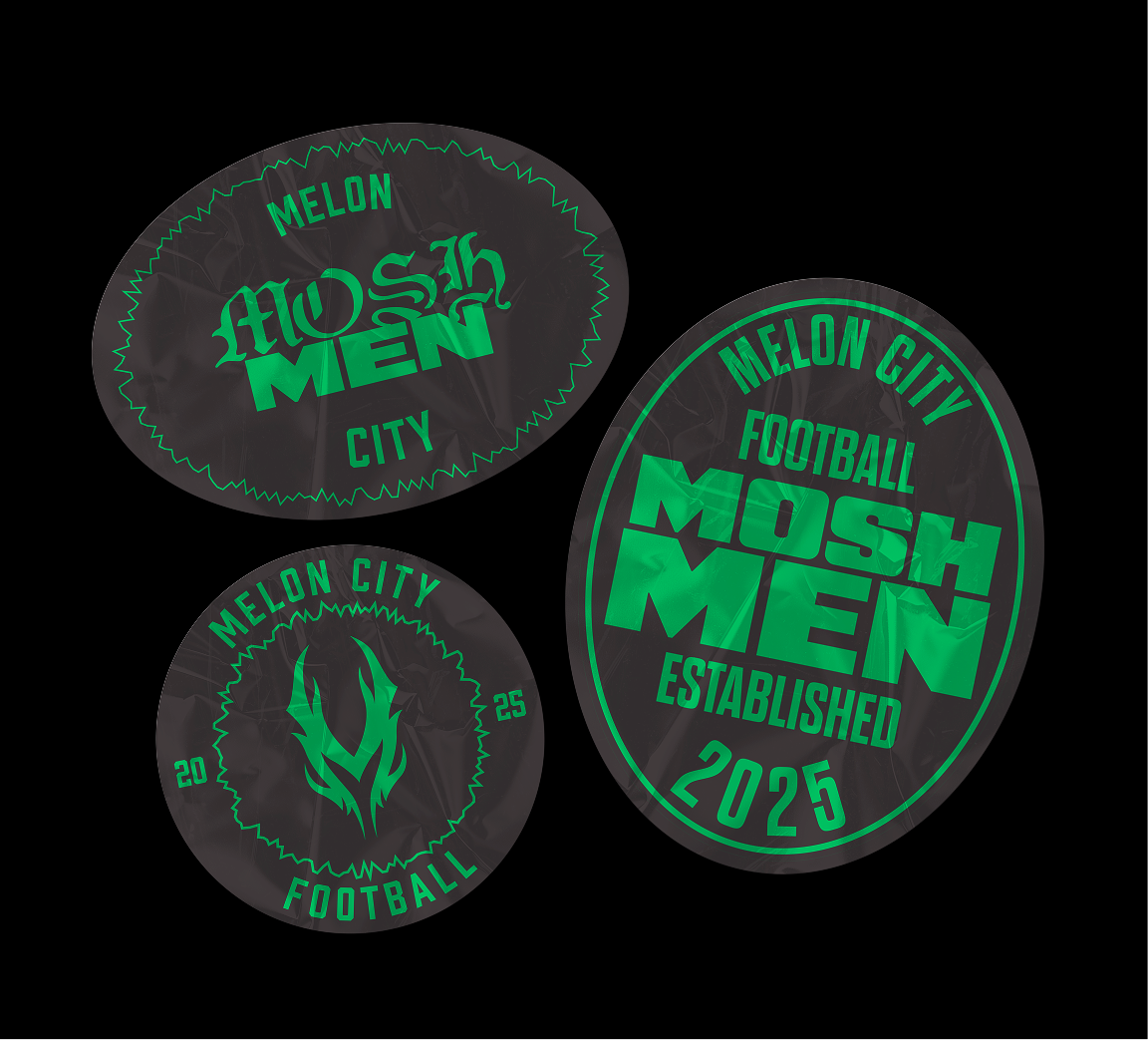
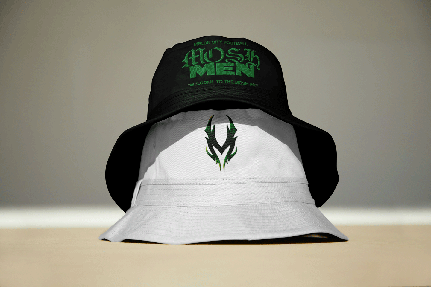
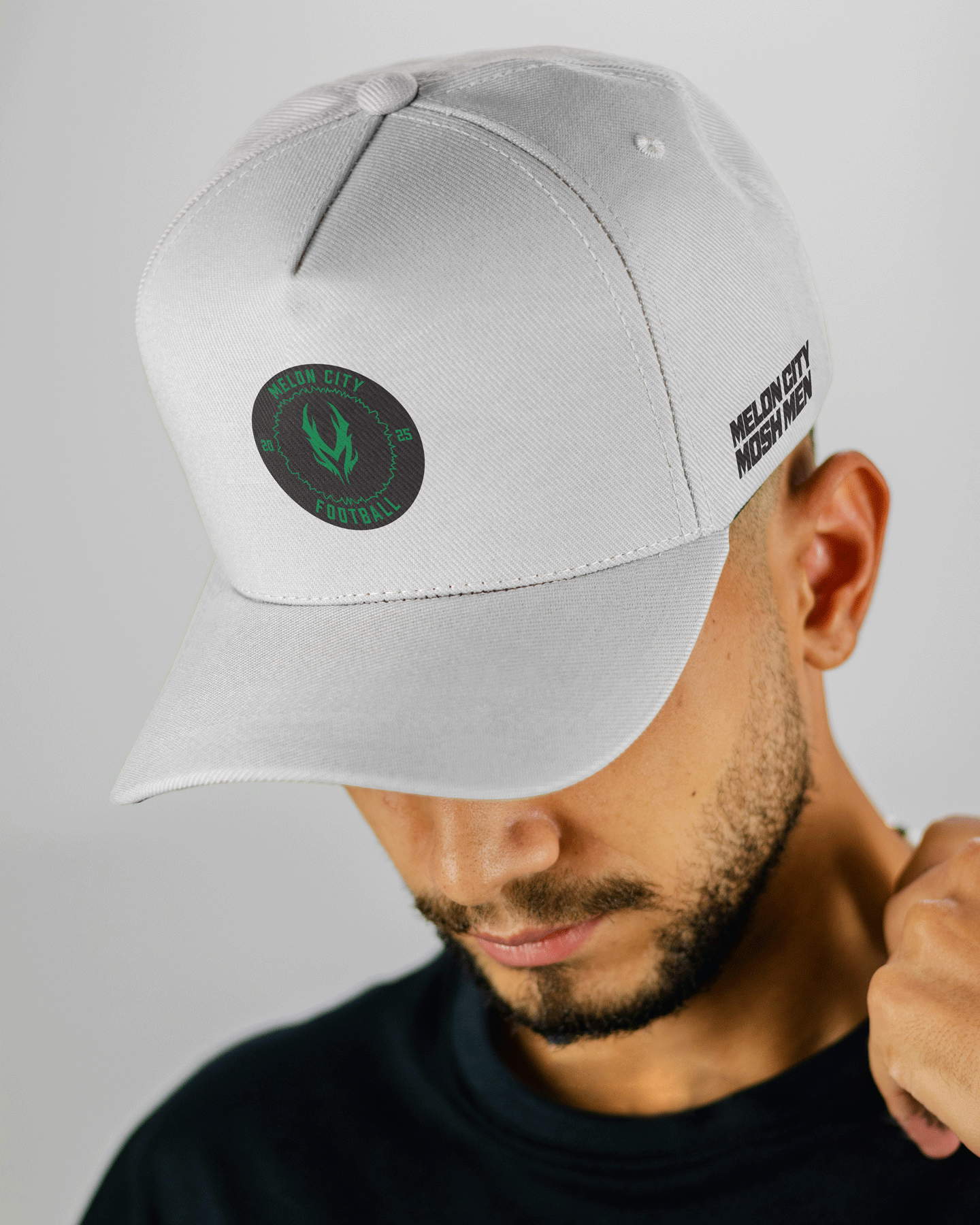
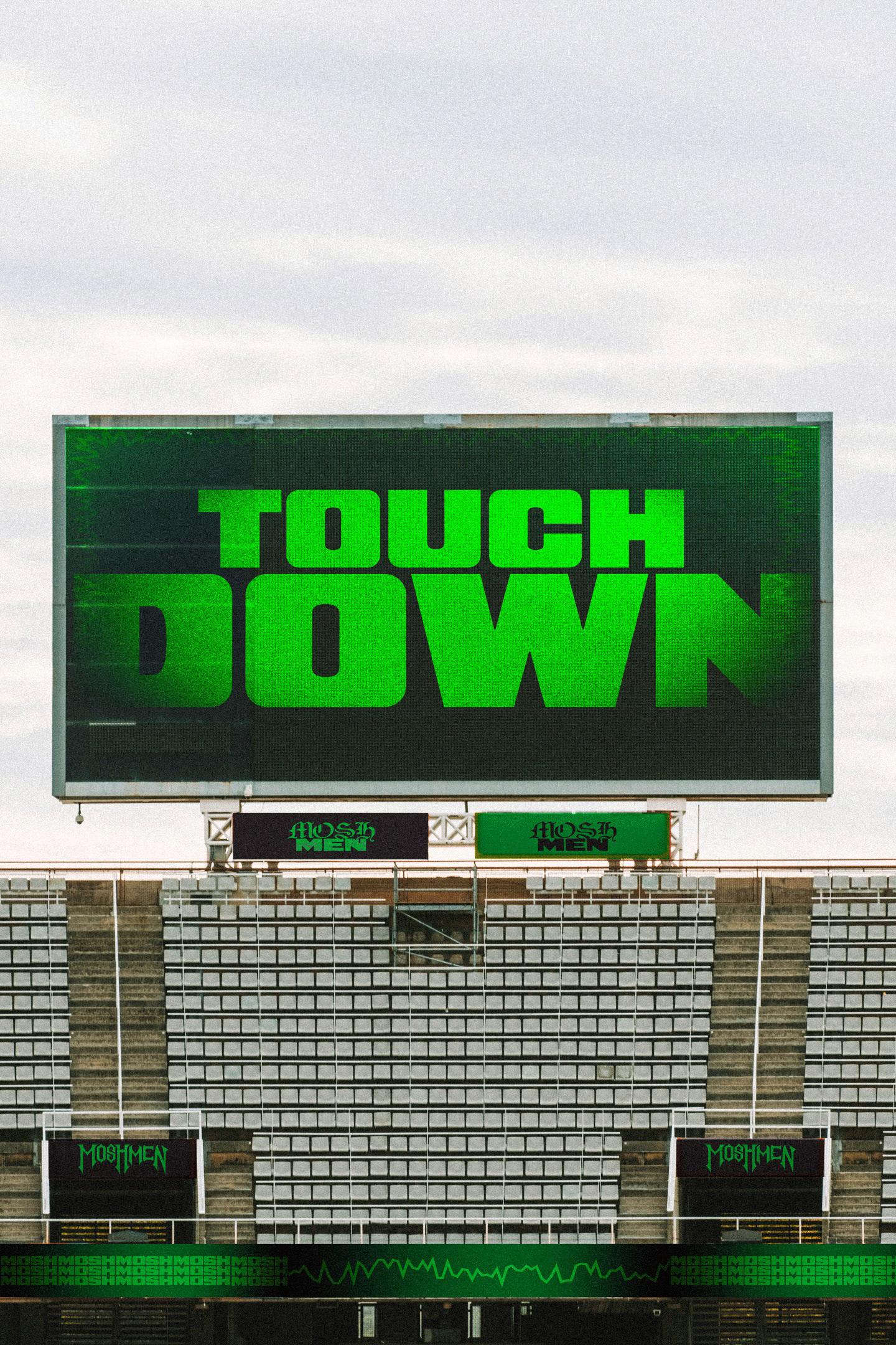
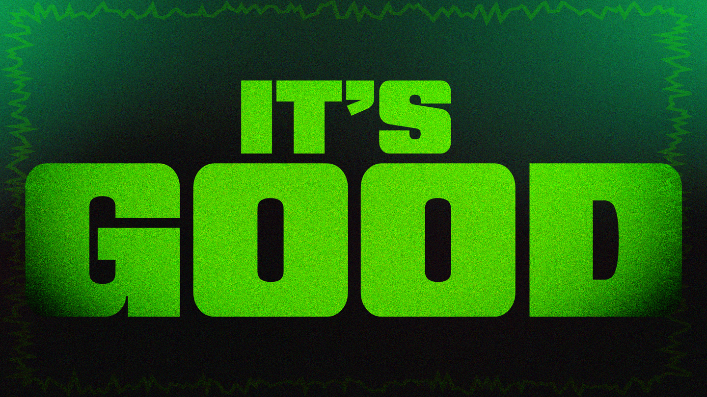
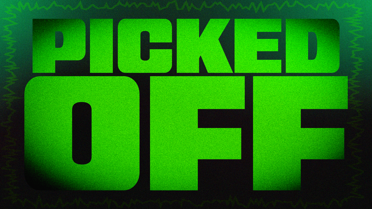
Brand tag collection, marks that can be used for a number of different applications while not being the primary marks for the brand.
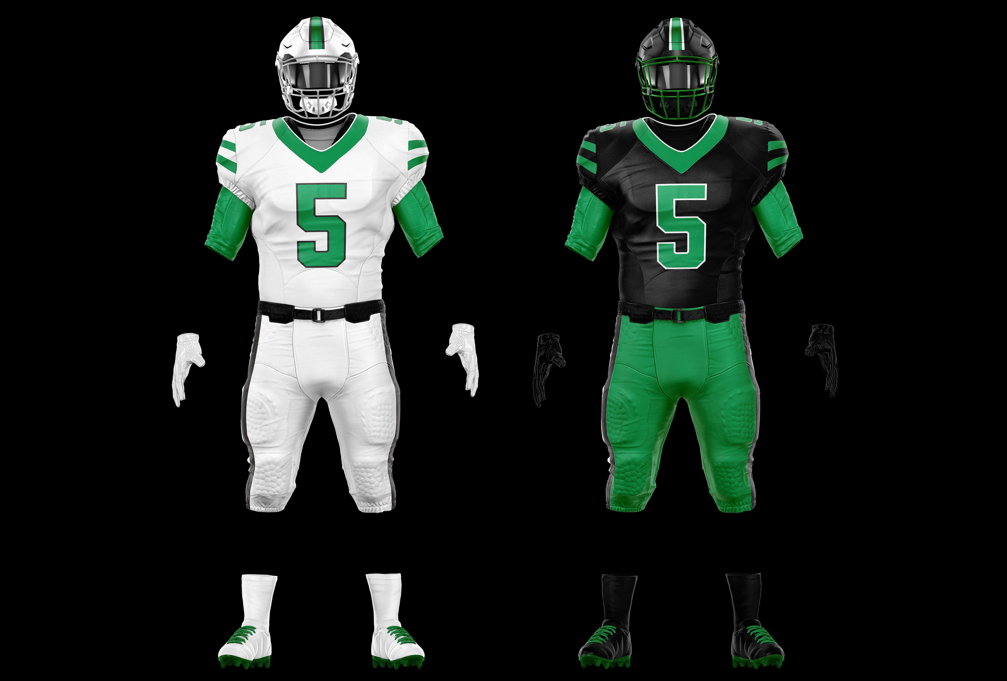
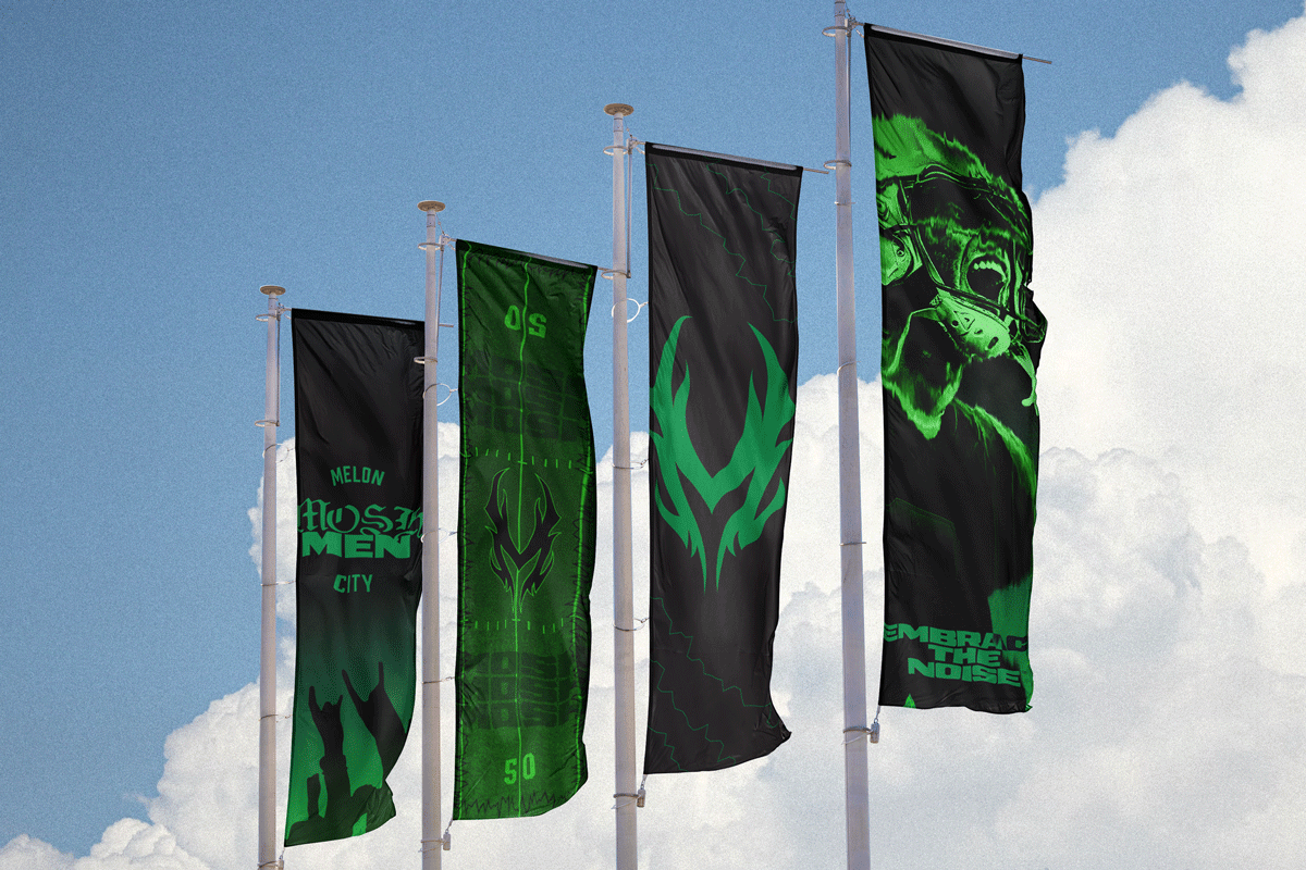
Away and Home uniform sets.
This was a passion project that I am very proud of. Being able to create an identity from scratch allowed me to be very creative and approach it any way I wanted, while also presenting the challenge of having to limit myself to make a creative decision. In the end, this project broadened my skills as a brand designer, from the amount of material I had to create to accounting for gameday experiences.